
Context
This is a collection of few very well known logos.
I noticed that most of the contemporary logos are very simplistic in shape and colour. All of these logos lack an outlining. Usually the logos have a background that makes the them standout. For example the Apple logo is

Some logos are the names of the companies and others are signs like for example twitter's logo is a bird, as tweet is an onomatopoeia for the sound that birds make, and that why the logo is a bird.
This is an example of logo design evolution. I wanted to bring it up because I wanted to show how the desings went from very detailed to very symatrical and simplistic. The Starbucks logo started of as a very detailed grayscale drawing of a double tailed mermaid. As the logo design progressed it got more simple and minimalistic, and became to logo that we know today. I wanted to show that some logos have gone to the minimalistic with the time, as the trend increased in popularity.
This means that I may be more succssesful in bringing attention to my logo if it is minimalistic and easy to stamp in the memory.
I got the evolution of Apple's logo to prove my point further. The firth version of the logo is very detailed, however in one year the logo changed drastically.

The logo became very minimalistic, the shape had no volume, up until 2002, and then it is currently back to no volume or shade, very much like the version of 1998.
Animated logos
I looked at few animated logos to get ideas.
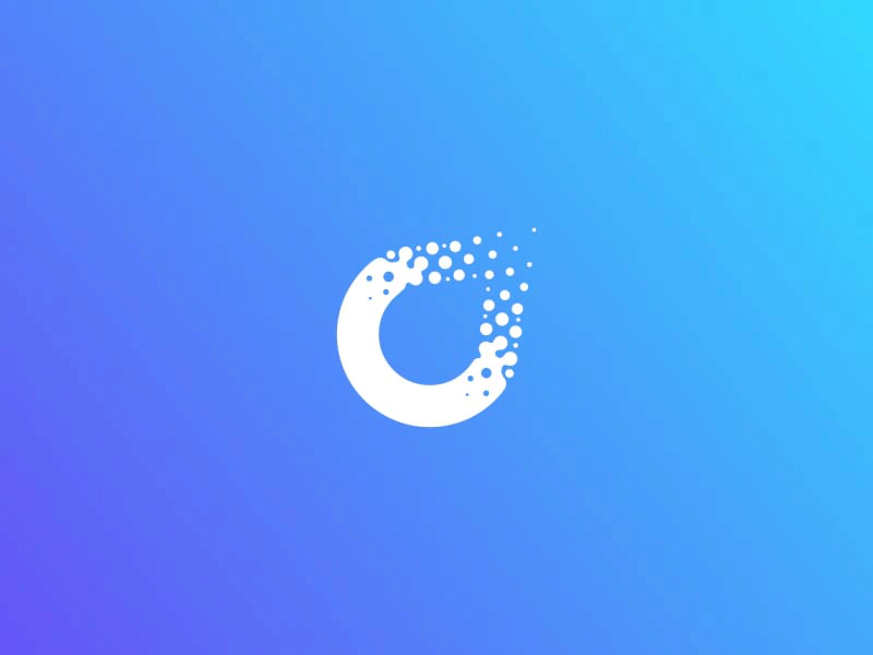
What is very noticeable is the blue gradient as a background for the white animated logo. when the logo appears as an animation it looks like water going trough a pre made mold. It looks very smooth
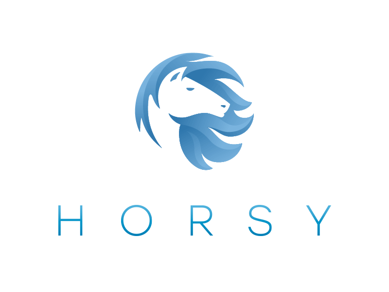
The horsey animated logo starts of greyscale and the there circles start to appear all over the logos showing that the logo is made up of circles entirely. After the circles disappear the logo turns blue from the outside to the middle of the logo. It is very simplistic and symmetrical.
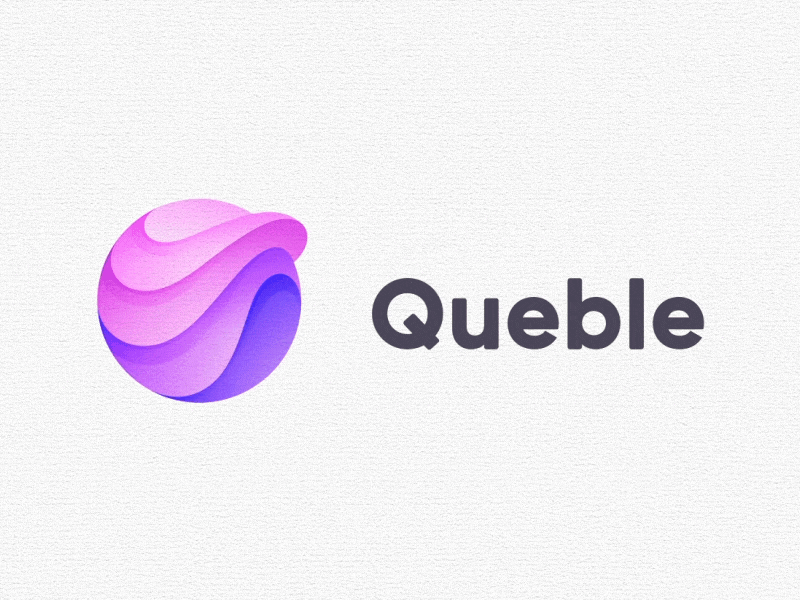
I like this one because it shows how it was made. It shows the logo was sketched on a grid using two circles and lines to make it as geometric as possible. The colouring og the logo looked like a speed paint, again showing the process of the making.
Mood-board


This mood board includes different kinds of logos ranging from logos that are in the food industry to ones like the Olympics logo. I have included all this logos in order to show the differences. The majority of the logos that I have here are quite minimalistic with flat colours, and most of them are very well known by the general audience, like Disney, Chanel and Warner Bros. And then there are the logos like the Studio Ghibli, Pinterest and JOJO's Bizarre Adventure that will probably be less recognisable to the older generations and more well known within the younger ones. It seems like the younger generations prefer more modernist approach towards the designs of logos, where as the older generations have seemed to prefer more detailed logos things in general for example lots of logos were pretty detailed for example Juicy Couture. It looks like the flat logos are taking over as they are easy to remember and nice on the eyes. They are also easier to transfer between different platforms which can be very useful.
My target audience is the people that like cartoons, anime and are interested in comics. I aim for teenage audience and young adults, or basically anyone interested in 2D animation and illustration. This kind of audience would be very well familiar with the interned and notified about the latest news in the world, no matter if they are political or about entertainment industry. I can attract my target audience by using a style or design that they might find interesting. For example an audience that is interested in cartoon and anime might be attracted by the style of my drawings, or on an interview for a job, for example 2D animator or illustrator they might expect the logo to be animated and for it to be 2D or flat.
As for my logo I plan to create a 2D logo closely resembling the one I did last year but instead of fish I choose to dragons because I really like them, and have liked them since I was very young. They are bold, and signify strength and courage. I want to use the same shape as my original logo, as it reminds of the zodiac sign pisces (my zodiac sign), and it kinda looks very peaceful, and contrasts well with the dragons, often associated with courage and war. The 2D logo .is aimed to attract my target audience, which is interested in 2D animation and illustration. Also I plan to make it quite flat and simplistic as 2D is often associated with flatness and minimalism, especially now that most contemporary popular logo are quite minimalistic. For the animation I plan to have a minimalistic animation without any colours to show the process of making, and after the motion of the animated dragons shift, the actual coloured logo with its background appear. I am not sure what kind of effect I will use to shift from the animation to still logos but I have some ideas. I think this idea could work quite well when presented on a University interview, potential apprenticeship or job opportunity, as it shows my skills in both photoshop and Animate.
Comparing Styles


Here I have my original logo that I did last year and my finished printable logo that made for this project. They are essentially based of the same thing and look quite similar but also different. To begin with the base of this two ideas comes from the zodiac sign Pisces. They both have similar shape and both come a pairs. However the Koi fish seem more detailed due to their texture and the shading of their tails, and their colours were meant to look realistic. In contrast with the dragons I wanted to with more minimalist but professional approach. Unlike the koi fish the dragons don't have realistic shading or colours, they are missing their outlines, and have an effect added to them. That is not say that one design is better that the other, they both can be very effective dependent on what audience they are meant towards, and what they are meant to represent. I like both designs, but with my knowledge that got over the period these two were made I was able to create something that I see as more professional and something that has more impact and represents me better.