
Planning & Production

I started with 4 designs of logos that I had in my mind, I divided a page in my sketchbook in 4 sections and I drew a quick sketch for each section.

The second sketch is the one of the logo that I made last year before the final project. This is very simplified but the shape the the fish are the same. This one was inspired by the zodiac sign of pisces (my zodiac sign). I chose the koi fish as in my opinion they are very peaceful nd gracefuland like that a lot. holding them toogether is a string of papyrus, just as silky as the fish themselves.
The first sketch I did very closely resembles one of the logos I analyzed in the research page. I really liked the design, and since I wanted to do something with a dragon in my logo, that was the perfect reference and example. What I did in this sketch was that I used the shape f the dragon chasing for its tail, making a circle and in the middle of that circle I put a sun. The reason for that is because a character I made is called Sunny and he can turn into a dragon, so I thought it will be a good idea incorporate my character into my logos.


The 3rd idea I had was of dolphin rising of the water. The theme of a dolphin liked the my zodiac sign the position and the action is changed. I had the motion of the logo in my head, so since this was a sketch I used a curved arrow to show the movement start and direction.
The 4th logo is based on the pseudonym I want to use for myself which is Dragonfly, and is connected with one of the stories I made. Since the story is about drgaons and dragons breathe fire, I thought of making a dragonfly on fire. I like this design but I feel like it is not what I want from my logo as it doesn't describe me all that well.


This is something like a small collage of few sketches of logo ideas that I have, and just freely sketch on that page in order to come up with variety of different logos. I mixed and exparimented with the first logo ideas I came up with in the hopes of comeing up with something unique and attractive.

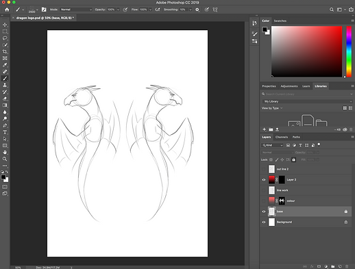
I started the making of the logo by opening photoshop, and creating a new layer and using the brush tool, on a very low size, to sketch the dragons. I used a grey brush to make the sketch quite light.
After I was done with the sketching I created a new layer and a started to do the actual outline of the logo in black. I did the right side first and to keep it symmetrical I just copy and pasted it for the left side and then flipped it horizontally by right clicking on it and then click "free transform" and then right click on the image again and click "flip horizontally"

Creating a mask
When I finished the out line of the logo I wanted to add a colour, but with a gradient that went from red to black, from bottom the top. To do that I thought of doing a mask so I don't have to erase an entire background. To create a mask I just pressed the button for mask at the bottom of the layers' panel.

After I created a mask I pressed "command + I" to make the mask black, as in the maks whatever is white can be seen and the black is hidden. I want to hide what I don't need to be visible from that layer. After that I clicked on the gradient icon in the tools panel and the double click on the gradient type options in order to make a customised one. I changed the colours of the gradient to red and black then I pressed "Ok".


After I set the colours I applied the new gradient to the mask layer. The colour of the gradient appeared, and then I made the outlines of the dragons visible.


What is in the black is hidden and all in the white is what is visible, by making a mask I can easily change the colour of the dragon, or change the gradient easily. Also I can add different kinds of textures as a colour for the dragons.

To make the colour of the mask visible for only as the dragons I used the brush tool (white to show the colour and black colour to hide the gradient underneath) I used the outlines as a guide to know how much I need to reveal. After I did the general shape of the dragon I used a smaller brush to clear up the details.

I looked for some brushes online form the website "Brusheezy" that I could use that will add interesting texture to the still logo. I found a pack of brushes which had the texture of cracks, and I thought that that may look nice with the logo as I wanted to give it a bit of a warn out effect. The pack was made up of around 15 different brushes, and what I did afterwards was to try each one out and see which on I liked the most.

I wanted a crack effect that didn't have a very realistic and standing out texture, I was looking for something soft and flat. I went thought all of the different options and the one that met my criteria the most was the brush numbered 132. It was quite flat and it gave out the effect of dried out paint when it wears out and cracks. I made the brush quite big so it fits the logo and then I just choose a placement and held for few seconds so I can get more evident cracks. I did that on the layer where the gradient was. I used an eraser to make the cracks so In case I change the background, the colour of the crack changes too.


I had two colours that I haven't decided between and they were quite deep saturated red and cyan blue, both gradients blending with black. Because I couldn't decide I tried both of them. I asked my classmates for opinions on the two colour. At some point I decided that I will stick with the cyan version but I had a discussion with one of my friends and she said that dependent on what effect I wanted to get then that is the colour I should choose. The cyan is generally calmer and doesn't stand out too much and can be very effective if it is used to suggest something cold, and restful. On the other hand the red one stands out more and shows more energy and power, and is very effective when used to show conflict.
My friend Erin suggested I use the red one as in her opinion it fits me better. So I decided to keep the red one.

I decided to change the black outlines with cyan colour and see how that works out. I used the the paint bucket tool to do that by selecting the layers and clicking on the lines with the bucket. I asked my classmates which one they preferred and most of them liked the one with the cyan outlines, so I kept that one.


After I choose the final colour I started thinking about the background. Because my friends compared it to spray paint on the wall I started looking for a brush that recreates a brick wall effect. I went back to the same website I used to get the crack brushes and I found brick stamp brushes that I liked, and then repeated the entire process for installing brushes again. This time was much easier and faster as I had to do it few times before, when I was changing rooms during the lessons. I made the stroke of the brush very big so I end up with quite big bricks.
I tried and tested few brushes and choose the one that looked worn out, so it could match the cracks on the logo. I found a brush that gave the effect of worn out bricks, whick is exactly what I wanted to find, so I tried it in white colour which fit well and then I tried with the dragons, to see if it looks good with them. The red was standing out on the grey-whiteish bricks better than the mint-aqua colour of the other version, which is even more justifies my decision to keep the red version.

Starting animation

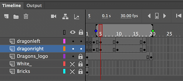
I stared by hiding the background of my still logo and then importing it to Adobe Animate. That way I will be able to make a separate background that will fit the dimensions of Full HD and I will be able to add the dragons without any backgrounds of its own.
After that was done I drew on a different layer the dragons a bit lower and curving, according to my storyboard.
Then I went back few frames, as I have set the curving dragons few layer forward. I drew the tip of the heads of the dragons right at the bottom, to show where the dragons will be emerging from. I created 2 separate layers for each side. Then I skipped one layer and created a new key frame, and rised the heads of the dragons a little more and then I did the same for the next frame, by moving it a little every time. I created 3 main frames and then started doing the in betweens.
After a tutorial on how to mask in animate I wanted to try that option and see what I can do with it.
To begin with before I started working in animate I opened the video on how to mask in adobe animate. Then I bring in the dragon log on its own and a background created separetly to fit full HD format. Then I one layer where I made the object that will create the masking effect. I choose a circle because it was show so in the tutorial and I think it will fit better than any other shape.


When I right click on the frames of the layer that the masking object is on and then choose "Create Motion Tween" The frames turn into a coloured line with only the key frames remaining, which reminds me a lot of how after effects' time lines look.
I wanted to add one more effect after the first one I did. The first circle I did I only changed the position of: I moved it from the lower left side to the top right, and then down in the middle and then up in between of the dragon. The new effect that I wanted to do followed right after the first one was done. I wanted to make the circle bigger so it shows the enitre logo and background. I scaled up the same circle after creating a new keyframe few frames away.


When I scaled up the circle and then I pressed play to see how the animation looks. The movement was alright but the scaling up started right from the first key frame, which is not what I wanted, but still looks interesting.
To get the effect I want I decided to do the two circles on 2 different layers. I cept the first one but created a new one for the scaling up. Firstly I created a new key frame next to where the last one on the top layer was, and then create a new key frame few frames later.

When I Turned the layers into masks I tried to fit the rest of the layers underneath them but then I was stuck with the fact that that I couldn't put hem under both masks at the same time, which is a problem and means that I had to find another way to create the effect I wanted but manage to put all the layer under it. Then while I was still trying to fix the two layer option, I thought that I could, create the key frames and plan before I turn the objects into mask, which will hopefully allow me to get the effect I want and to manage to fit all the other layers under just 1 mask.

I deleted all the masks from my previous attempts, because I wanted to have a clear start. Before I followed The steps from the video tutorial I planned where I want the motion of the first part to start and where to finish and the I did the scale up part, before I do anything else. I started with motion tween for the first part, and thankfully the motion tween only took place between the beginning key frames that created, and didn't bother the frames I kept for the second part.
Then I did the motion for the first part, I did the scaling up for the second part. I sized up the circle until it covered the entire full HD format, in order that once I turn it into a mask the circle will scale up and gradually reveal the logo and the background. Everything went very smoothly and once I was done with the movement and was happy with how it looked I turned the layer into a mask and put all the other layers under it.


This is the final video of what I did by following the masking tutorial.

I went back to my original storyboard, though I already had one finished animation. I really wanted to get this one done as it was my original idea, and it represents my animation skills better.

There is not much to describe about the process of the frame by frame animation. What I did was to break down the motion I wanted to create to key poses, the poses that define the movements, and then go in between to key poses and by turning the onion skin to draw what is happening between those to key poses.


I used the advise of making the key poses first, from a tutorial on how to animate transformation. I have used this technique before but the video reminded me of it, and showed me an example of how that looks in the process.
While I was working on the animation I noticed that on the 22nd frame the wings of the dragon were a bit more retracted than the previous and the following key frames, which created the effect of the wings opening and retracting unnaturally quickly. I went back to that frame and redrew the wings while being guided on how much to open by, again, using the onion skin to look at the previous and following frame.
After I finished with the motion the shape of the dragons wasn't very clean, but that was okay because my plan was to create the effect of motion first and then clear up the frames one by one if needed. I cleared the sketched frames and and added detail to wings and their heads.
I was struggling a bit with the last few frames because I couldn't get the movement quite right and it looked awkward. I had to redraw the last 3 frames over and over again to try to get the movement right, but it seemed to not work. I realised that my last key frame, that I directly copied by drawing over my printable logo could not fit with the animation because the tail wasn't bend correctly for a movement like this. In a way it looked unnatural to try to get to such a shape after the motion of the dragon. I decided that I will try to get to the initial pose as much as I could, but so it still looks natural. I managed to that by just bending the tail slightly, close to the shape that it takes in the printable logo. I couldn't bend the tip of the tail outwards, the way it is on the still logo, as the movement would look unnatural so I kept it the way it was.

After the motion was done, I created 2 new layers. On one of the layers I added the brick background that previously made in photoshop, and the other layer I used a white colour brush tool, and coloured the entire Full HD canvas, and put everything except the animation layer underneath it.

I created a key frame on the white background layer, 3 frames after the animation of the dragon ends. I locked all other frames except that one, and then choose the eraser tool and every 3 normal frames I would create a new key frame and would erase a bit, in order to show the dragon logo and the brick background that is hiding under.

I had the onion skin on to check how much I have erased each key frame. When I got to the drawing of the animated dragons I had to erase them as well as the white background, so I made a new key frame each time I had to erase a bit from the drawing. I did bit by bit, checking every time if the motion looks good, and then continuing to the next frame.

This didn't take too long to do as I only had to erase a little of the white layer, every frame, and there was no need to follow any specific instructions. Once the erasing was done I saved my progress, checked the animation few times and then exported it as a video to '' Adobe Media Encoder'' to convert the 'fla' file into a playable HD quality one. Then After I did that too I checked the video to see how it rendered and then I saved it to my college cloud.
