
Practical skills

These are some sketches of some logo ides I did in my sketchbook. I choose a page and used a ruler to divide it into 4 sections. In each panel I did one ketch of an idea for a logo. In secondary school i used the same system in order to decide and develop ides I might have. This gives me the oportunity to finalise on 4 ideas and the 2 and then choose a final one, ore even combine two or more to create a completely new idea.

I did another page of sketches using the ideas I liked the most from the previous page, and tried to experiment with them by mixing them or adding different elements or positions. I didn't divide the page in sections this time because I wanted to get something more of a collage in order to get new ideas. I used pencils and for some fine liners in order to show a more clear sketch. For one of the logo I tried to show with arrows how I want to movement to look.

Few months ago in one of our drawing lessons we had the task to draw some close ups, and recently I decided to do that again, and practice the close ups in more depth. I looked up some photography as a reference. I used a pencil, mechanical pencil, eraser and mechanical eraser. I sued the regular pencil to sketch the main shape of the eyes and to shade the drawing, and I used mechanical pencil for the smaller details like the pupil or the eyelashes. I used the mechanical eraser to erase to create the highlights in the eye and other details. I am pretty happy with the result of these sketches, happier with some more than others, but in general I like the shading and the shapes of the eyes, and I like the realism that I managed to achieve.

On the other page I decided to do sketches of hands. I used the same materials for these sketches except I used a 3B pencil for the darker hand. I had to use a darker pencil, to fill it in as the model had quite dark skin. I didn'tfill in the higtlighted areas and intstead
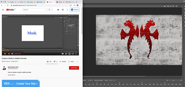
Creating a mask
When I finished the out line of the logo I wanted to add a colour, but with a gradient that went from red to black, from bottom the top. To do that I thought of doing a mask so I don't have to erase an entire background. To create a mask I just pressed the button for mask at the bottom of the layers' panel.

After I created a mask I pressed "command + I" to make the mask black, as in the maks whatever is white can be seen and the black is hidden. I want to hide what I don't need to be visible from that layer. After that I clicked on the gradient icon in the tools panel and the double click on the gradient type options in order to make a customised one. I changed the colours of the gradient to red and black then I pressed "Ok".


After I set the colours I applied the new gradient to the mask layer. The colour of the gradient appeared, and then I made the outlines of the dragons visible.


What is in the black is hidden and all in the white is what is visible, by making a mask I can easily change the colour of the dragon, or change the gradient easily. Also I can add different kinds of textures as a colour for the dragons.
Downloading and installing a brush in Adobe Photoshop
Because I was looking for a brush that will give dragon scales effect, as one of my classmates suggested. I went to a website for brushes for downloading called "Brusheezy", and looked for something that will fit. Then I saw brushes that created "cracks" effect and I really liked how they looked so I decided to give them a go. First I downloaded them from the website and put the zip file, which I later opened, on the desktop, so wont loose it.

Because I didn't know how to to install the brushes or how to add them to Photoshop I looked for some tutorials that could help. I looked on youtube as I find it easier to see and hear the steps I need to follow, rather when they are written. The first video I watched was not quite helpful as the animate version in it was older than the one I use so the settings and steps I had to follow for this one weren't matching.

The second tutorial that I watched was exactly what I needed in order to install my downloaded brushes. To install the the brushes I first needed to make sure I had the brush panel that is usually on the right hand side of the screen when I open photoshop.

Sometimes here
In my case
I had to press the icon on the very top of the brush panel on the right hand side. Then when the menu opens I have to click on "Import brushes", the I have to find the brushes from the desktop and choose the file. And once I click on them they will be in the brush panel in a folder under the name of the brush pack that I have installed.

I wanted a crack effect that didn't have a very realistic and standing out texture, I was looking for something soft and flat. I went thought all of the different options and the one that met my criteria the most was the brush numbered 132. It was quite flat and it gave out the effect of dried out paint when it wears out and cracks. I made the brush quite big so it fits the logo and then I just choose a placement and held for few seconds so I can get more evident cracks. I did that on the layer where the gradient was. I used an eraser to make the cracks so In case I change the background, the colour of the crack changes too.

I went back to the same website I used to get the crack brushes and I found brick stamp brushes that I liked, and then repeated the entire process for installing brushes again. This time was much easier and faster as I had to do it few times before, when I was changing rooms during the lessons. I made the stroke of the brush very big so I end up with quite big bricks.
I tried and tested few brushes and choose the one that looked worn out, so it could match the cracks on the logo. I found a brush that gave the effect of worn out bricks, which is exactly what I wanted to find, so I tried it in white colour which fit wel
I followed the tutorial on how to mask in animate, and created my own version just using the instructions. I used my logo to try the tutorial on it. After I imported the logo I had to create a new object that will create the masking effect. I created a circle just like the tutorial
After I created the circle I right clicked on the frames of the layer of the circle and clicked on '' Create Motion Tween'', as the tutorial said, and then I dragged the circle from the initial position, to another. I had to create a new key frame before I change the position of the circle. When I moved the circle there was a trail, that links it with the its previous positions. When I was happy with the movement. I right clicked on the layer of the circle and pressed Mask. An icon appeared on the layer signifying that it was a mask. I had to put the rest of the layers under the mask if I wanted them to be covered by it.
