
Practical Skills
how add a glow/blur effect in Adobe animate

Based on the tutorial on how to create a glow effect in Adobe animate, I did my own quick test to try it out and learn how it works.
Firstly I drew a circle with the brush tool. Then I created a new layer, copied the circle and pasted it on to the newly created layer.


After I pasted it I selected the shape, right-clicked on it and then selected "convert to symbol". I named it "singlow" and the clicked on the "ok". After that I clicked on the shape, and on the right side, near the tools, I saw the properties panel. I found "filters" and clicked on the "+", which showed me a drop down menu, and I clicked on "glow" (in the tutorial the person clicked on "blur" and I tried both of them, and it this case I didn't see much difference, and in my case I think its better to use glow anyway). That, as the name suggests, gave the shape a glow effect, however it was a pit too small, so I played around with the settings of the effect and increased them to my liking.

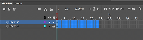

After I adjusted the glow, I followed the tutorial and tried to make it pulse. I selected both layers and added a key frame on each layer after 24 regular frames. I went back to properties and changed the colour effect to alpha (when I was doing it I had no idea why I have to change the colour effect, and the tutorial doesn't explain why either).
After I adjusted the colour effect, I went back to the timeline. I selected the layer that had the glow effect on and then moved to the newly made keyframe and just scaled up the shape using the transform tool. I scaled it and checked if I was happy with it. Then I added another key frame on each layer, after 24 regular frames.


Just like in the tutorial I added had to add a classic tween to the frames of the layer that has the glow effect. I right clicked on each selecting and then selected "create classic tween".
animating in photoshop


After the tutorials I watched on how to animate in Photoshop I decide to try out myself, by following the second one I watched, as i found it more useful. Before I started I had to Make sure the workspace is on "Motion", by going to "Window" fining "workspace" and selecting "motion".
Then I went back to the timeline and I selected "create frame animation".
Before I started with the animating I had to unselect "Create new layer for each new frame" and "New layers visible in all frames", by going to the top right corner of the timeline. This was mentioned quickly in the tutorial, and when I tried animating I understood why. I could see the new layers I created in the previous frames which was definitely something I didn't want.

I started with the first frame by drawing each body part in a separate layer (The torso, right leg, left leg, right arm and left arm) name them accordingly, and then when I finished drawing I had to put them in a group.
To create the 2nd frame I first had to duplicate the group and renamed it p 2 ("p" for position) And did the same for every next group, and just changed the number.

I had to create a new group of layers for every frame , and just adjust it a bit before moving to the next one, in order to create the effect of motion.
i finished on the 4th frame as this was just supposed to be a quick test and then I had to render it by going to file -> export -> render video and then just check the settings and the destination of the file, and press render.

This is the outcome of the test. I quite like it, yes it is very simple and quite fast, but the whole point of the test is to just try out the software. I was alright with using Photoshop to animate thought I didn't really enjoy the part where I had to create an new layer/ duplicate the group each time I needed to add a new frame, and I can only imaging how filled up the layer section will look if I am to do a quite a long animation, which will probably cause a lot of confusion. I still do like the fact that I could use custom or uploaded brushes unlike Animate. Also the blur tool could be more precise and can be used on a small area, unlike the blur and the glow effect that effect the whole symbol it was applied to, thought that could be positive or negative dependent on the situation.
I think I will be sticking with Adobe Animate, as I don't want to use a software that I am not familiar with for my FMP, even-thought I have used Photoshop a lot, but not for animation. I will still be using photoshop, but only to do the background/s. Using photoshop for animating is something I will definitely consider doing, just not for this project.
Production Begins
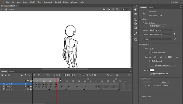
I opened Adobe Animate, to start the animation. I have my storyboard as a guide and the reference images, to help me with the rotation.
When I opened Animate, I chose Full HD to work on, which is exactly what I did in my old project.
I created two layers and on the first one, I put the images one by one 15 frames apart (I do that Just in case and to give some space). I sketched very basic skeleton over the images, just as starting point.
Usually, in Animate I stick with using the brush tool because I find it more comfortable.


After I finished sketching on top of the photos, I locked and hid the layer they were on. Since the reference is from real life, obviously it will have a quite realistically proportioned body, and the style I planned to work with is not so realistic. So what I went back to each frame and separated the head from the body, made it little smaller and made the head bigger, and then positioned them back in their original pose.

Next, on the first frame, I drew a circle and copied and pasted it until they made up the hight of the character. That was to show the proportion of the character. Now thinking about it I could have just copied the head and pasted it, which would make more sense.
I was playing around with the spacing in order to get some different speed, and not make it look mechanical

After I finished the "skeleton" frames I started drawing the outlines on a different layer with the brush tool, but this time with black colour, instead of light grey.
When I finished with the basic outlines I showed the outcome to my parents. They quite liked it and my dad suggested I could make it little slower it would look better. I would do that after I clear the animation a little more.
There was some excessive movement when I played the animation, for example, the hands and feet were inconsistent and kept changing shapes, so I went back and fixed those mistakes by making the shape or position of feet on anything else that was causing the problem. I had to redraw the shoulders and arms on a couple of frames as some of them looked stiff and others looked very relaxed. I went for the more relaxed position and redrew the stiffened ones.
Also, I had to add a couple of inbetweens to make a few of the frames that seemed stiff, in order to make them smoother.

This is how the basic outline animation looks like. It is a bit bumpy and irregular especially because of the brush tool the lines stay very rough, and all those little irregularities are visible when I play the animation. But since this will just be a guide layer for the final outlines I don't worry that much, and I like how it worked out, but I think I may play around with the "ease in/out" to hopefully achieve a more natural look.
WINGS EMERGING (TEST)

This is an animation test that I did in order to better understand how the wings/tail will look when emerging.

First I drew the character very quickly so I have a base of some sort. This time I used the paintbrush tool instead of the brush tool which is what I use most of the time.
I knew there was a difference between the two, Generally, the Paintbrush tool was neater, and looked better when I was using it, where on the other hand the regular brush tool looked messy. With the regular pixel brush tool, however, I can use the option for pressure sensitivity or change the shape of the brush from circle, to square for example.
After I drew the character I moved on to the actual motion bit. I went about it quite simplistic with most in-betweens missing, not very smooth because I just wanted to see how it would look. Basing on my storyboard, I started to draw the "substance" gradually emerging from the back of the character. For the substance I was imagining it being a dense liquid, almost like lave, then I thought of how lava lamps work and look, and I knew then that this was what I wanted the substance to have the effect of.
I searched for some videos on youtube, and I found this 4-hour long lava lamp video, which is basically 4 hours of a lava lamp in the dark. I was observing the lamp trying to learn how to recreate the movement, which actually reminded my of the first project I did this year, the "Movie Intro" one. I was doing Howl's Moving Castle for the project, and in one of the scenes I was recreating, a card would suddenly "explode" and in that explosion, the heat or fire ( I don't know what it is supposed to be) reminded me of what is inside of the lava lamp.

So I dug for the animate file of the animation and finally found it. When I drew the substance in the test, I was sometimes going to that file and basing the flow/ movement on it. I was not copying it but just trying to give my test animation a similar effect.
This is the scene from the "Movie Intro" project
This is how the test initially looked (I know that it looks bad I took the video on my phone because I forgot to render it when I was at that part). At the beginning I only did the outlines of the substance and then when I got to the reference above I used colour with no outlines. I did use the outlines to keep the colour in the borders, but I removed them once I finished colouring.
I think of maybe using the Paintbrush tool for most of the animation to get neater outlines, However, for the colour, I think I would rather stick with the brush tool since it is more organic looking, and easier to use for fill in. I may need to go back and redraw the frames from the first scene, using the Paintbrush in order to keep the consistent and tidy lines throughout the animation.
After this test, I feel more prepared for the scene and I understand better how to achieve the motion I wanted to, I just needed to give my visualization a physical form in order to understand it better.

BACK TO MAIN PRODUCTION
To draw the outlines I used the regular brush tool. Now after the test I did with the wing transformation, where I used the paintbrush vector tool, I realised how much neater it was than the brush tool, so I decided to switch to it.
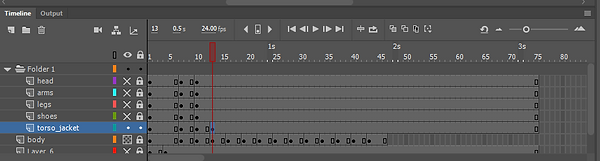
When I started to draw the details I drew each group on different layers, for example, the arms were on a separate layer, and the legs and the torso as well. I put them all in a folder, in order to be easier to navigate through later on. Separating the body parts will make the process of animating much less complicated and helped with organisation, and also in a way creates a routine that I have to go through every new position.
For the new outlines, I had to add the hair and the volume of the clothes. I didn't have big issues with either, as the hair stayed pretty much the same, I just needed to adjust it from time t time in order to keep up the effect of turning, and the clothes I had to do the same as the hair, it just took more time to do since there were a lot of details to keep a track of in order to make the spin believable.
When I was doing the basic outlines using the brush tool, they looked quite messy and inconsistent, which is one of the reasons I switched to the paintbrush tool. I drew every single frame each time since there was no point of keeping the previous drawings, they were all way too different from each other, which is what gave the animation the inconsistent look I mentioned. One pose will be way too hight than the previous or the next one, or a leg or an arm would be too long or too short.
However once I moved on to the final outlines I had to keep the first drawing and change it slightly each frame, where I had to. In those occasions, I used the transformation and selection tools to alter the size shape or position of the object or the detail I was working on. I used the "free selection tool", to select the area I wanted to select everything that was on the layer I was working on. I would use it to rotate, scale-up/down or move the object.
I used the "Lasso tool" when I needed to be very precise, and I mainly sed it for small details, or to avoid selecting areas I didn't want to affect.
Mainly when I was as drawing the jacket I had to use the line tool for the shoder pads, and for the black lines on the jacket. The hotkeys were extremely helpful since that way I worked a lot quicker.

I kept the stroke size on 1.00 most of the time unless I had to do smaller details. I would reduce the stroke size to 0.50, and I had to do that manually since when I was using the hotkey I would go down straight to 0.10, and that was too small.
I would occasionally play the animation every time I have finished a pose or a detail to see if it looks good and if it actually shows the effect of turning and zooming in.


When I needed to elongate or rotate something, I remembered that using the anchor point. When I wanted to elongate the jacket but I wanted the top to stay fixed I just dragged the anchor point to the top of the jacket and then just pull the bottom down. That way The top stayed where it was, but if I kept the anchor point in the middle, both the top and the bottom will elongate.

When trying to make the character turn around I had to change and hide some body parts. For example the right hand I had to hide slightly each frame until it was hidden by the rest of the body.
I rendered the animation once I finished with the outlines. I still have the eyes to do, and I know they are going to be quite tricky to animate, however, it is on its way to be done.
Doing the outlines was more adjusting and going over the details to fill in any gaps, rather than drawing. After the first drawing on the first frame was done the rest was just altering the look of the details slightly each new frame. The hardest part to do for me was the jacket, I had to alter it each new keyframe, and I had to think about how it would look from the different angles. In particular, it was very important to keep the correct proportions of the jacket and compare it with the basic outlines (the layer was on 50% opacity), which I had visible underneath the new outlines.
The head was also a bit tricky to do to. The first two frames were decent, the movement was doing well with the head, on the 3rd frame however I went too much sideways, and it seemed that the head was moving independently from the body, so after I was done with the rest of the body I went to correct the head. The curly locks on Sunny's forehead played a big role in determining the extent of the rotation for the head, which is one of the main reason I added them. Up to the 25th frame the head was looking out of place so I went ahead and fixed it by turning the onion skin and comparing every following fame to the previous one.
New scene test

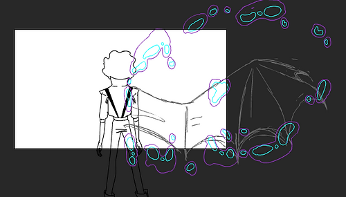
This is a quick test to try out if animating the wings emerging from the back will look (not completed)
For this scene, the wings will emerge, and at the point where they become too large to fit in the screen, the camera will zoom out. I thought I could use classic tweeting to do that for the character ( I will continue with frame by frame for the wings because it will look somewhat unnatural to use tweeting on them).
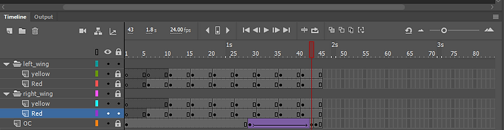
Firstly I drew the character very quickly just to have something like a base. Then I copied the frames from the first test I did on the wings and passed then. I had to move them around and scale them down a bit because the original "wings" were a bit too big and were in the wrong place. I turned on the onion skin just to be sure that the wings on each frame emerge from the same place. After I finish fixing the frames I copied them and created a new folder and a new layer and pasted them there, and they will serve as the left-wing, as the other side serves as the right-wing.


The newly pasted frames, however, had to be flipped to mirror the right side ones. So to do that I had to lock the frames for the right-wing, and unlock the left ones, then select them, right-click -> Transform -> flip Horizontal. I had to do that for every next frame and make sure they were lining up with the right-wing ones.

I had to do some filling in since in the original test I erased the parts of the wing where it was overlapping with the arm of the character. Since the ed area and the yellow are on different layers ( I prefer separating some details, just because it would be easier to change them without damaging an overlapping detail) I stated with the red layer and filled in the part that was cut because of the arm, and did the same for the yellow after I completed the red.
After I finished dealing with the wings I moved on to the character. As I said in the beginning at the point where the wings are to bg to fir the screen the camera will zoom out, and for that, I plan to use classic tweeting. I have used tweeting before e, I have use motion tween in my previous project, and classic tween in the test where I was learning to add the glow/ blur effect, so I have so experience in how it works.
So I used classic tween to scale down the character so that it creates zoom out effect. I adjusted and scaled-down the wings accordingly to the character.
To create a classic tween I need to turn the character into a symbol, and to that, I selected it with the free transform tool, right-clicked on it and then clicked on "convert into a symbol", then I have to name it and after I click okay the object is now a symbol. Then I have to create a new keyframe where I want the tween to end, and after I do I scaled down character.

After the keyframes where done, I right-clicked on the frames between them, and then selected "Create classic tween".
Now, before I successfully created a tween I tried a couple of times to do it, and they all didn't work. I had an idea of why my attempts always failed, but I wanted to double-check first. So I found a video on youtube explaining how to create a classic tween and the person on the tutorial did the steps I described earlier. However what I was doing before was, I had the start and the end of the tween before converting them into symbols, which is why when I was trying to create a tween before wasn't working out. And I am sure that was the reason because after I watched the video I went and tried both ways - the way the tutorial suggested and the way I was doing it - and unsurprisingly my one didn't work out.
When I played the animation after I completed the tween I came to the realisation, that once I turn something into a symbol, it will be quite tricky to change it or add anything to it. That thought came to mind because I saw that the legs of the character where unfinished, and I couldn't go and add a bit each frame since the character was already a symbol and in a tween. This means that I will have to draw the character from head to toe if I plan to use tween on them, in order to avoid cases like this.
Generally, I think this was quite a useful test since I learned a couple of things from it. I like trying out things to see how they look before proceeding with the idea to the main piece.
Colour change test

I 've seen something similar to this in a transformation tutorial that I plan to cover in my research, but basically, as the test show, I tried to change the colour of this shape from blue to yellow. I will use this technique in the 4th scene in my storyboard where the character stats to turn into a light silhouette and becomes larger.
For this kind of transformation, I used the "shape tween" for which I don't need to turn my object or drawing into a symbol, which gives me more flexibility to change that same shape in the future.
On the first keyframe, I drew with the brush tool a blue shape, then a couple of frames away I created a new keyframe but just changed the colour of it by selecting it with the free transform too and clicking on the section where I chose colours from, and I choose yellow. After I was happy with the colours I right-clicked on the normal frames in between the two keyframes and choose "Create Shape Tween"


After the tween was ready I duplicated the layer. I used it to add some glow effect to the shapes and to see if the will change colour like the shapes. To add glow effect I had to click on the frames themselves and not on the actual shape. I added the glow effect, changed to the colour of it to yellow ( I started with the final keyframe).
I played around with the properties of the glow and increased its size. Then I went to the first keyframe and did exactly the same, but with a blue colour.
This test was quite quick, and I was applying skills that I already knew to determine if I am able to achieve what I visualise through my storyboard, with the techniques I plan to use. It was quite useful to know beforehand if this was going to work or not because in case it didn't I would have had to find a solution, and I would have needed time to do so.
Adding eyes

After some tests to prepare me for the 2nd scene, I went back to animate the eyes for the 1st scene. This is the result of my work. For now, I will keep the sketched eyes until I have time to go back and draw them with the paintbrush tool. Once the eyes are more refined after I draw the with black colour I will know better if they have worked out all right, however, for now, they look good.
I created a new layer for the eyes and drew a new pair of eyes for each new frame. I used the loch of hair of the character to determine the middle of the face of the character (I didn't draw the locks of hair in the middle, but they worked out as a great guide). I would draw a vertical line starting from the locks, down to the chin. Then I drew two horizontal lines, that will determine where the eyes will be and how hight the eyebrows are going to be.

Since the eyes were drawn on each frame from a scratch, they all needed up looking different from each other, which is something that I expected. I was doodling around trying to adjust the eyes and make them work. I found a frame on which the eyes worked extremely well, so what I did is I copied the frame where the eyes looked good, and pasted it to the frame next to it and then I adjusted the eyes/ brows/mouth, using the free transform tool and the lasso tool, so they fit the position of the head. I was surprised when this approach actually worked quite well, I think it may be because the eyes and eyebrows were approximately the same size and were the same distance apart from each other, which is something I couldn't achieve with the onion skin option (which is what I usually use for to make sure things line up), as the frames were too far apart, because of the nature of the scene.
On the last couple of frames, the eyes and eyebrows were drawn on the same layer as the head, and they were done before I even started wedding eyes to the rest of the frames. After some thinking, I decided to keep them there as the eyes have worked out pretty well and I can't think of any issues that can happen because of this. However, the lips that were going with these eyes were on a different frame because they were overlapping with the line art of the face, so it would e tough to move them around if I have to.
Starting the 2nd scene

Each wing was in a separate folder inside of the scene folder, and that way I could keep my work more organised.
After that was sorted I created a new layer where with a red colour, using the regular brush pen I did a sketch of the back view of the character. First I drew the whole character inside the canvas, with the intention that later on after I draw the final outlines I will scale it up as my storyboard shows.
Before I started with the new scene I made sure that all the layers from the 1st scene are in a separate, named folder. I created a new folder that will hold all the layers from the 2nd scene and them I created a new layer inside the folder. I used this layer to passed the frames from the most recent wing animation test. This way I can keep the timeline tidy, which will help me avoid possible complications.


After sketching I made and I was happy with it, on a completely new layer I started drawing the outlines with the paintbrush tool. Before moving on to adjusting the wings, I converted the outlines to a symbol and then created a new keyframe where I predicted the wings will appear. I scaled down the character down, on that frame, and then Right clicked on the empty frames in between, and created a classic tween, which I intend to use for the zoom out.
So I moved to the wings where I had to fill the in-betweens. I worked in tows, where I skipped one frame and drew on the next. I used the normal brush tool to draw the "substance". I had the onion skin turned on to see how much I have to draw on top of the previous frame. I planned to do one side first and then copy those layers and flip them to use for the other wing. I left the yellow highlight for later after I 've done the red part of the substance.


After I finished with the wings I was checking them to see if they looked good. I had a couple of frames at the end left, but I already started o think how I am going to make the wings zoom out, together with the character. Since the character already had a tween which I should have not done in the beginning, if I wanted to size down the wings to be proportionately correct, I wouldn't be able to get a good looking result.
The animation above is my first attempt to adjust the wings to the character as he scales down. It looks a bit weird and the wings look like they are not sizing down with the body. I had to find another solution to fix the problem, which is why asked my dad for advice, as he usually comes up with good suggestions. I have more about this on my Problem-Solving page, so I will just proceed to the option I choose to go along with.
So firstly I created a copy of the current fla. file and renamed it, just in case I change my mind and want to go back to the point before I proceeded with this option.
Then I duplicated the tweened character outline layer and hid the tweened one. I removed the tween on the duplicate. I kept the size of the character the same throughout animating the wings, that way I was able to complete the animation and then I was free to scale up and down after everything was done.

I had to finish all of the frames on the substance first before moving on to the actual wings. There was some adjusting to do, Thankfully I had saved a copy of the animation before my first attempt to synchronise the wings and body, so I used that version. I had to scale up some of the frames, as they looked too small to fit the wing. Then after the already made frames were ready I moved to the couple of final frames where I had to animate the substance "dissolve" I used the animation I did in my "Movie intro" project, which I have a video of a little above in the same part where I have done my first test f the wings emerging. I used this video as a guide to help me understand how the particles spread and slowly got smaller and disappeared.

I used the onion skin a lot when I was doing this last frames. I had to see where the particles were in the last frame in order to know where to move them. The big particles eventually broke apart on 2 or 3 bits, with small ones in between to show the separation, and gradually they became smaller and smaller until finally they were completely gone.
All of the particles were headed away from at the wing, as as the end frame the wing opens with a great thrust to clear itself from the substance.
After I was done with the substance I moved to the actual wings on a separate layer, underneath the red and yellow of the substance. I had to leave the frames where the substance was still one whole thing and was still getting bigger quite quickly. I drew the first frame of the wing animation where the substance exploded suddenly. I had the substance as an outline in order to be able to draw the whole wing.

I already have experience in animating wings open up and I have animate a dragon taking off, so I found this part quite easy and quick to animate. I sketched the wings on each frame using the normal brush tool as a starting point, and later after I finish I will go over the sketch with the paintbrush tool. I chose grey to sketch the wings so when I go over them with the paintbrush I don't get the outlines confused.
For the first couple frames, I made the wings extend gradually, and where the particles spread suddenly, I made the gap between the new and previous frame a lot bigger to emphasize on the thrust, which is also supported by the particles jumping away from the wing all of a sudden with a great force.

(These two frames only have one regular frame in between them, both for the ings and the substance. This gap is to show the sudden thrust of the wings to get rid of the surrounding substance.)
I left a couple of the substance frames empty and left wings visible.
Background animation test

This was an extremely short test to check if my idea to use a panoramic background would work, and what dimensions I will need to use. So I imported one of the panoramic photos I took and then I sized them down accordingly by holding the "shift" button to keep its proportions. I figured that the backgrounds will have to scale up and move along with the character.
So I set as a first frame the part of the background where I am looking from a front view, and fit the top and bottom to the edges of the "canvas". I turned the background into a symbol.
The as the final frame I set the background so the part where the side is shown is inside the canvas. I had to scale it up a little to show the effect of zooming in.

ALL CAPS TITLE

Once I finished with the wing outlines, and the main colour (red ) of the substance I moved on to do the yellow highlights. I was still working on only one side, and after I finish with the yellow, I will move on to copying the same layers for the left wing.
Some of the frames already had highlights, and I just need to come to the in-betweens and also adjust their size and position.
When the substance was still a whole thing, I would draw the yellow n the middle, but it would emerge from the same part like the red. This is similar to how the fire looks, usually, the lighter the fire is the hotter it is, and obviously the middle and the part where the fire started from will be the hottest.
When I got the part where the substance separates, I drew the highlights at the part of the particles that were the closest to the middle/ wing.

Main production...

I moved on to the outlines of the wings. Since I already had the sketched animation I just had to do the outlines with the paintbrush tool.
At first, I wanted to colour the wings in black, but once I got out of the canvas I couldn't see the outlines, so I changed it for a brighter colour. I settled for red since when I start colouring the wing will be yellowishly covered by ash grey, so red would work nice, and if it doesn't I can always change it.
I drew the whole wing in all frames, even if parts of it were covered by the substance in some occasions. Otherwise, this was very quick to do, so it was time to move on to the next thing.