
Initial Research
Transformations
Since transformation is pretty much the main focus of the animation, and frankly and still don't have an idea for it, I think it will be useful to look at some of the inspirations that I have for the transformation, and try to extract as much ideas from them as possible. Here are some examples I found quite interesting:
youtube
One piece transformations
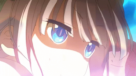
My first source of inspiration for the dragon transformation is the anime One piece. There are few transformation that I liked, one that is directly related to what I'm searching, which is dragon transformation, and the other is a dinosaur transformation.

I really like this transformation as it shows how the body gradually changes from different angles. I like how different transformations are shown from different angles in a such a way so they compliment the transformation. For example when the animators want to show us the transformation of the eyes of the character we have a front view close up, and when they want to show us how his face elongates to turn into a dragon snout, we are looking from side view.
This is a very effective way to show the transformation, because if the mouth change was shown from a front view it would have been hard and confusing to tell what was happening and how much the character's face elongated, or if the eye colour change was show from a side view, or from far away it will be hard to see that change, thus it will makes no point of showing from an angle that would not compliment the transformation.
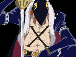
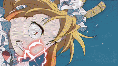
Another transformation I really liked from One Piece was the one of a character called X Drake and his power is to turn into dinosaur. Since very often dragons are considered related to dinosaurs I decided that this will stand as a good transformation example, and also because I like this transformation because of how simple it is and still does it's job of showing what it's supposed to.
The transformation is very short, and basically what happens is that e zoom in close up to the character's eye, then the iris fluently changes colour from blue to orange, while the pupil enlarges and turns brighter shade of orange. As the pupil enlarges and turns orange, it also creates two additional irises, both the same colour, while a new pupil forms to replace the old one. During the changes in eye, we can see how the character's skin tone changes to green, suggesting the change is not only happening for his eyes but also the rest of the body. After the transformation is completed we zoom out to the whole character and what he has turned into.
I think that despite being very quick and simple this transformation is pretty good. It works well, it's quick, easy and still manage to show the change. I particularly like the part when we zoom out to see the character in full height. Because of how quick the transformation goes, I still have the human form of the character in my head, and when I'm shown the dinosaur one it is easy to compare them and realise how much difference there is. Despite this I am not sure that this is what I am looking for as I need something more active, more exaggerated and extravagant.
American dragon transformation

Another example of human to dragon transformation I was thinking about was from the show "American Dragon", which I used to watch on Disney Channel, when I was was younger. This is one of the shows and films that made me fall in love with dragons, so I couldn't not add it to my research.
The key feature of the transformation of the character is the fire. The fire is what enables the transformation by just simply traveling over his body. Unlike the dragon transformation from one piece the changes of the character's body take place immediately after the fire travel over the character's limbs. As for the tail and the wings, which were not originally part from his human body, the fire just rises and grows, and once it's gone the wings and the tail are what's left.
I like this transformation a lot because of how the fire was used as a catalyst for it, but that is exactly the reason why I don't consider using fire for my transformation. I feel like fire has been over used when it comes to dragons, and this is a very stereotypical transformation. I might use the idea of some kind of substance for the transformation, but not fire.
Miss Kobayashi's Dragon Maid
The transformation here, just like the one in American Dragon, are very rapid. However unlike the fluent flow of the fire, the transformation here is very sudden, and happens in a heart beat. Between the before and after the transformation there is a moment of a black frame, which gives the effect of a quick change. I watched a video recently that used the same technique but with models on a spinning wheel. This is called a Zoetrope, and it uses light to create the illusion of the movement of the models. The time when the light illuminates the segments is only when the character is in new position, so we only see the sequence and not the blurry bits.

I find this very similar to the transformation of Miss Kobayashi's dragon maid. The black frames between the before and after are avoid the "blurry" bits.
This is a good way to avoid the gradual change into a dragon like the first transformation in One piece, which can take a long time to animate. In contrast this one is quick and still gets to the point that it is trying to make.
The transformation is also supported by what I think is some kind of wind, in order to make it more rich and entertaining to watch. The wind/air? disperses after the transformation, in order to make it more prominent. I personally think that this is a good addition to the animation. It looks like pretty interesting technique in order to enhance the effect of the transformation.
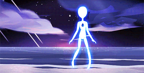
Steven Universe Reforming and Shape shifting
This are transformation from the Cartoon Network show Steven universe. I wanted to have a look at different types of transformation not only dragon ones. I do this with the hope to get an original idea for the transformation.
This short gifs show the process called reforming, which takes place when a gem loses its physical form, so it reforms in order to get a new one. In the show it is mentioned the physical forms of the gems are made of light, they are holograms projecting from their gem and have mass, so it makes sense that when a gem reforms its form is basically light until they finish reforming, which basically means that colour changes to other details lack due to the minimalist nature of the transformation. In some cases during the process of reforming, the silhouette of the previous forms of the gems can be seen, but just for a moment.
The gems turning into light silhouettes is not exclusive to just the reforming of gems, but also when they transform, for example change outfits, shape shift and other body altering actions. This is very interesting as it means that form and light distortion has to happen in order for the gem to take it's desired shape. However they all have a default form, that they turn back into eventually, which means that they can not stay in a shape shifted form for long.

I think this is an interesting way to show transformation, and in this case it works very well considering its context. To use a transformation similar to this one will be very exiting and exiting to explore, and will also spare me from animating the little details in gradual change of the body of the character, but will make it no less effective. The question is rather this will be effective in my case and is it going to be right type of transformation to use for the transformation of my character.
I quite like all the transformation examples, and I think they are quite appropriate for the show/character/situation they were used for. I particularly find the Gem Reformation and The American Dragon transformation ones, and I was thinking on combining these two.
How to add glow effect in adobe animate.
I was in a dilemma if I should use Adobe animate or Adobe photoshop to animate. What I prefer in Adobe Animate is that I have used it for a long time and I am more familiar with it instead of adobe Photoshop in regards of animation. On the other hand Photoshop has all this drawing tools like the blending tool, the Smudge tool and other great tools for colouring and shading. In particular I needed those tools to create a glow effect. I was looking if it was possible to create an animation in Animate and then import it to Photoshop in order to colour it in. I couldn't find anything about that so proceeded to look for a tutorial that explains how to create it.

This tutorial that I found on how to create a glow effect in Adobe Animate. There weren't many tutorials of this sort, and most of them were for After Effects, and weren't even linked in any shape or form to what I was looking for, so it was quite lucky I found this one.
The intro to the video ended at around 0:34, and after that the tutorial started. The first thing that the person did was to create a new layer, name it, then they selected and copied the visor (the shape they used for the tutorial), and then pasted it on the newly created layer.
Then they selected the shape and then converted into a symbol. There where 2 ways to do that, one was to right click on the object and press "convert to a symbol" or to press F8. After that they went to properties, and then to "filters" clicked on the "+" and added "blur". The person advised us to play around with the values, to get the effect we wanted.
I was trying that on my computer while I played the tutorial, and I clicked on "glow" instead of "blur", which also worked good, so now I have two options to choose from or I could also combine them.

After they have added the effect, they wanted to make the glow to pulse, which is something I didn't look for, however it sounds interesting, and it could greatly better my final product. The first thing they did was to select the same shape that the blur was applied to, go to properties, find colour effect and select Alpha. Then they went to the timeline and added a new key frame 22 key frames away from the previous one, on both layers.
On the new keyframe they selected the transform tool then selected the glow and scaled it up. After that they added another keyframe, again 22 frames away on both layers. They right clicked each section and and selected "Create Classic Tween". I tried to follow that too, which like the glow, turned out pretty good.
However even-tought I did find a way to add a glow and blending effects in animate, I will still do an animation test in photoshop just to try it and see if that will be suitable to use for the ptoject. I did mention that I felt more comfortable with Adobe animate in regards of animating, as I have used it longer for that purpouse, but maybe I'll will find Photoshop a more comfortable software to use for animation?
How to animate in adobe Photoshop
I didn't know that animating in photoshop was an option before until one of my classmates, Erin, told me, so I decided to look it up and try it and decide if maybe I could use this software, instead of Adobe animate.

The first tutorial I looked, obviously how to animate in photoshop. It was pretty hight in the results and it looked like it will be useful, so I clicked on it to see what it was about. As we move on from the intro to the video, the Creativid Studios (that is the person's the youtube channel name). proceeds with the opnening of a new Photoshop file, by going to "custom" and well...customising the properties of the file before he begins. He sets the file on 1920 x 1080 which I believe is the resolution of the Full HD.
This I think is quite important as later on in the video he mentions that you will need to set the width and hight to the resolution of the video, if you are going to add one, but since I have used the full HD resolution in my last project, and that comes as a preset in Animate, it is important to change those properties in Photoshop as well, as Full HD doesn't come as a preset there. Ps. I checked Photoshop and found out that 1920 x 1080 was actually a preset there, so, yeah, my bad.
The person mentioned that you will need time line and, where to add it from, and then procced to create a new layer, but a different kind, the went to the top part of the screen, clicked on layer and added Video layer. The layer could be seen in the layer's section and it had the film icon which is what made it different from the other layers.
From this video I learned where the onion skining option was, which was something I was worried that will be missing. It is a little hard to access I will have to open a particular window everytime I need to change couple of settings, which in Adobe animate can be done very quickly as all the essentila tools for animation are there.
The he started drawing a ball and wanted to start animating it, I realised that he wasn't using frames but seconds. I was very confused about this, and I realised that eeven-thought i learned couple of this about animating in photoshop, I wanted to work in frames instead, because the change on the frames is quite visible, where in contrast when the youtuber, was working with seconds I coudn't see any frames and I could see that to move to the next second to animateyou had to double check if you were on the right one.
I proceeded to look for another tutorial, and this time in my search I mentioned "Frame by fream", hoping that I will get something close.

This tutorial is a basic frame by frame character walk cicle.
The person (Ethan Dray is his youtube channel name) created a frame animation, by clicking on a button on the timeline that said "create frame animation". There were avtually 2 options- one was the frame animation one and the other was video time line, which is what the previous person in the previous tutorial choose.
He drew ech body part on a separte layer, and named them depened on the body part. Aslo, he made sure to select the layer of the body part before animating.
I noticed while he was working and created a new frame for the next position, he wasn't using the onion skin, unlike other tutorials I saw were doing. I went to my own photoshop and tried to find the onion skin but I was unssuccesful. Instead he was copying the layers of the body parts which were in a group, and the pasting the group, but changing the name of it. The names of each group were the names of the positions in the walk cicle they were supposed to represent. He selected the newly pasted group, clicked on the new frame and started working on it after hiding the group for the previous postion. Occasionally he would make the hidden group visible to use as a guide/ onion skinning.
Art styles
I haven't decided on what art style to go for with my character, as I feel like my one is a bit complex, and I want to go with something more simple for the project. I want to look at various very prominent art style and hopefully, come up with something interesting or choose one that I like and mould my style based on the ones that I like.
I did a little mood board of art styles from cartoons and anime that I really like. These are the styles that I want to get inspiration from for my own style for this project.
1) This Is Kim from Kim possible, one of the shows I used to watch as a kid on Disney Channel. What I really like in the style from this show, was the linework and shapes of the characters, especially the female ones. The outlines of the characters would usually be a darker shade of the same colour of their skin on clothes, for the exception of dark colours, they work the opposite way - a lighter shade for the outlines. As for the shapes, there seems to be a contrast between smooth lines and sharp edges, which I think works very well. Where there is elongated continuous flow, the lines would be flowy as well and where those lines end and meet, the edges are shart, for example, the elbows and the hair.
2) This character is called Angel Dust, from Hazbin Hotel by vivziepop. Currently, the show only has the pilot episode that is originally uploaded on youtube. I really like the proportions of the characters (usually long limbs and small torso). I also like that the characters tend to have animalistic physical features, though that doesn't necessarily mean I that I add animal features to my designs, which I don't do often anyway. Another thing to note is that the characters usually have quite big eyes which allows them to be more expressive in their emotions.
3) Danny Phantom, from the show Danny Phantom on Cartoon Network. This series was created By Butch Hartman, also the creator Of " Fairly OddParents". I like how simple the character designs are, and the sharp edges in the linework. I do like the proportions of the characters, but I wouldn't necessarily go for them, in this case, I would prefer the Kim possible ones, or the Hazbin Hotel, over Danny Phantom ones.
4) Characters from Steven Universe on Cartoon Network. I have Noticed that Steven universe characters, especially the Gems, tent to have the reoccurring theme of shapes in their designs, like squares, triangles, circles, etc.. Some features can be very extreme, and often are connected to the character's personality or at least they compliment it. Steven Universe proportions are not exactly set, but it is definitely a prominent style, especially with the eyes, and as I mentioned before, their figures.
5) In Looney Tunes, it seems that the shapes and proportions are quite dependent on the character and their personality, or what creature they are. I don't see any specific line work, but I have noticed that the eyes of all characters are quite big eyes, and most of them are missing a coloured iris.
6) Chibitalia ( Hetaila, an anime/manga about the personified countries. Chibitalia is regarding to the episodes where the characters are presented as "chibi".) Chibi style has very baby-like proportions, as it is aiming to be as cute as possible, and people tend to find big eyes, puffy and short arms and legs, tiny noses and basically any features that remind of a baby, puppy, kitten or any animal baby in general. I like this style a lot, but I don't think it would fit the theme of my animation. It just won't give out the effect seriousness that I am trying to get since it is too cute XD.
7) Nu pogodi!/ Well, Just You Wait! is an old soviet cartoon that I watched I lot with my sister when we were younger. I always liked the cartoonish style of the characters, and the episodes, each had a different plot, were full of comedy. The main characters do have somewhat realistic human proportions, even though they are actually animals. The hight of the characters, try to be as close to the actual animal's ones.

1)

3)

2)

4)
5)


6)

7)
"How to create crazy cartoon characters"
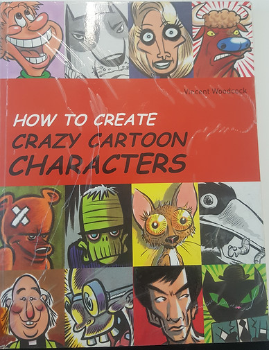
During break on a college day, I went to the LTC to get some primary research to support my project, and since I was thinking about exploring different art styles. I went to the Art and Design section and searched for something that could help me. I found this book called "How to create crazy cartoon characters". Looking at the cover, I wasn't sure if I should have a look inside the book, since my character design was kinda ready, and I was doing an animation for my FMP, but I thought I might get something useful out of it.

I had a quick look trough the pages, and I got to the section where anatomy was, discussed. I am quite familiar with anatomy as I had done it for a previous project last year, and I also do a lot of character sketches and drawings. However learning anatomy is a key stage in order to be able to create exaggerated characters, so seeing that first page of the anatomy section acted as a nice reminder, about the importance of fundamentals

What I particularly like from the first couple of pages was the "cute characters" section. It explained what are typical characteristics for cute characters, for example, usually they have a ration similar to young children one, which is something I heard from I video, that was analyzing the character designs of disney princesses. ( The video is below)
I found this quite useful, as for the animation I want to go with more cartoonish and "cute" style, that will be easier to animate, but I will have time to add the colours. Having the circles on the side to show the difference of the proportions is quite useful and is a good way to help visualise the idea of proportion.

The next pages were about "building blocks" which basically means you use pimple geometric shapes to create a unique and exaggerated bodies for your characters. I've seen a lot of similar tutorials, and what I've learned that shapes could really compliment the context of the character, for example if my character was a soldier, like the example in the book, I would use angular and harsh shapes, with great volume, to show the soldier's "solid muscularity"

There where also tips on how to give life to your shapes, as they are quite fixed and can look unnatural, which is something I have experienced while designing my characters.
They would look very stiff and unnatural, until I started to add more flexibility, and draw with rounded lines, and depended on the movement I will shift the "mass" I have made for the character, since the actual skeleton is quite static and is not quite expressive on it's own.


The next section was about facial features, which is something I will need for couple of scenes in my animation, and also is something I've been struggling with. Unable to give my characters appropriate expressions, make them look unreal, and kind of cold, with no life, which is why the moment I saw this section I took these photos to have them as a reference and learn from the notes that support them.
The first part of the section was mainly focused on realistic looking eyes and expressions, which again proves that to get a more personal style and learn this aspect I need to start with the fundamentals.
The next part more stylised and cartoonish selection of eyes and expressions. It was very interesting to have a look at so many different styles in their different expressions and positioning. I personally don't have a distinctive style for drawing eyes, and this looks like good reference to help me create one.


The following section was about heads and faces, and I decided to add it as a general knowledge and reference. Again learning about heads and faces started with photography accuracy, and then shifted to more exaggerated head shapes and facial features.
The page next to it was about using geometric shapes to make faces interesting and unique.
Right after I got to the section of caricatures. I focused on the section where a real face was used to create a caricature. There was a realistic portrait of a woman, that was used as a reference for the caricatures. There were 4 different caricatures based of the lady's face, all slightly different, however looking at them I could still tell it was the same woman. With caricatures, we take the most distinctive features of the face and just put more emphasis on them and make them more exaggerated. With two of the caricature examples, the artist emphasized on the asymmetry of the model's face. The in contrast the 3rd example focused more on the model's curly hairstyle earnings and big nose. The last one is quite far from the reference, but still attaining few of the original features, like the curly hair (kinda), and the overall head shape.


On the next page there were some drawing tips, and suggestions about the character's facial features exaggeration, dependent on their personality, and attitude. I decided to bring that up as I find it very binteresting how some physical features can be stereotypical for a certain personality.


I particularly like this section as it could help with creating more expressive moments while animating. These effects were meant to give the sense of motion to the still drawing. There were some effects that could work as good smear frames, or just to help to create distinctive animation style, and a good example of that I think is the drawing of the person running. It reminds me of old stile running, like the ones in Tom & Jerry and Looney Tunes.
Taking Photos


I was worried about the first scene of my animation. I knew it will be quite hard to animate, but I wanted to keep it as I was looking forward to the challenge. To help me animate the scene I knew I will have to get some references. I searched on youtube and google, but I couldn't find anything closely related to what I was researching, which meant that I will need to get some photos done. I asked my friend, Elizabeth to be my model, and she agreed.
During lunch we went outside, to get some good lighting, and to have a big space to work with. I took 5 photos, coming from front to side view while zooming in and eventually having somewhat of a close up of my friend's profile. I did a couple of attempts in order to get it the way I wanted it, so I ended up with these images.
I asked my friend again if she minds being on my website, and she said it was all right.
These photos will be my references when I start animating the first scene of the storyboard. They will be extremely useful, since as I mentioned before it will be quite hard to animate the rotation movement.
While I was preparing to start with the character animation I realised that for the first scene I will need my background to rotate as well, which basically means that I will need to make it in Animate.
I went to youtube and typed "how to animate background rotation in a frame by frame animation", where I did get some examples but not of what I needed. I tried to think about where else I could get a similar effect, and then realised that anime fight scenes will be a good idea to start with. While I was watching a video, I thought that a panoramic image could work well as a reference, since it does have that effect of motion.


I decided to take my on panoramic photo since it will be the exact movement and position I want it to be. I went to the park near my house to take photos. There is a building that I decided will be representing the casino, and then it was the matter of choosing the right position to start from. These are the results of my little trip to the park:


They seem quite helpful, but I wouldn't know until I make the background and seem how it looks on the animation. I will use the one that has a more defined front view of the building in the front.
Alternatively, I could animate the background in Animate, if that will be a better option, but again I will need to test out and decide.
I don't have any more rotations, just static frames for the background. Further on I just plan to have blended colours close to the colour scheme of the background, for further scenes.
12 principles of animation
I decided to look at the 12 principles of animation in order to be able to create natural-looking and professional animation. This is the video I watched in order to help me better understand those principles. It is 24 minutes long and covers all the principles by briefly explaining them, and giving visual examples when they are talked about. There is a playlist of short clips (the same video but there is a video for each principle) each covering every principle, which I believe will be better to navigate through, but I added the whole video since that is the original one.
1) Squash and Stretch
This is the principle where an animated object will get longer or flatter to emphasize their speed, momentum, weight and mass. The video mentions that the "amount the object stretches and squashes says something about its mass. The more stretched and squashed it is the softer it is, (like a water balloon), and clearly and less it squishes and stretches the stiffer the object is".
An important thing to remember about squash and stretch is that, when applying this principle, it is important to remember to keep the overall volume of the object. I was to stretch a rectangle upwards and downwards, I will need to quash it on the sides, in order to keep its volume consistent.
2) Anticipation
Anticipation is when a character prepares for action to give the audience a clue as to what is happening next as well as to make the action more realistic.
Anticipation helps communicate actions to the audience by preparing them for the next action. For example, in many cartoons a character will wind up before taking off, This is to prepare the audience for the action that will follow.
The objects have to be clearly visible during the anticipation, which means there shouldn't be any competing actions.
3) Staging
Staging is the presentation of any idea so that it is completely and unmistakably clear. This principle can apply to many areas in animation, for example, Acting, timing, camera angle and position, and setting. This way you have full control where the audience is looking. You have to make sure it is clear to the audience where to look. The main action of the scene should be very clear and it can't be upstaged by other things going on since that distracts the attention for the audience from the main point.
You should let one action finish, before starting a new one instead of overlapping them, and sometimes even insert pauses to give the audience time to process what is happening.
Staging is also very important when trying to express emotions. If a character is happy, then make sure that the audience knows that and feels it.
The whole idea is to make it very clear to the audience what you what to portray.
4) Straight ahead and pose to pose
These terms are referring to the two methods to animate drawings. The straight-ahead method is where you draw the first frame then you draw the next one and then the next one and so on. The second method pose to pose is where you draw the beginning and the end of each main pose, and then go back later to fill in the in-between drawings
Pose to pose method is better for most actions since it gives you the opportunity to have the action planned ahead, and that way it gives you more control over the animation. That way you wouldn't worry if the character is going to end up in the right place or be the same size since the action is mapped out.
On the other hand, the straight-ahead method is good for unpredictable animations. For example, Fire and explosions will work well with straight ahead since the are unpredictable actions. It will be hard to predict how these will look with pose to pose since there are laws of physics working at a constant rate in these actions.
The video suggests that there is "some vocabulary that goes in to pose to pose animation. Firstly there are main poses called the Keys, secondary poses called Extremes, and finally broken down poses called Breakdowns. Do the Keys first, then decide the farthest the character will go using the extremes, and then decide how the Extremes will connect using the Breakdowns. That way you will have the most control over your animation.
There was a quick example of Overlapping action in this video, which would actually be covered in the next one, however, the concept was to have the action done with pose to pose method and then any appendages done with srtaight-ahead method. That way there will be no distractions between the action and the appendage.
5) Follow through and Overlapping action
This principle basically refers to having all body parts and appendages dragging behind the rest of the body. Follow through and Overlapping action are often associated with a different technique called Drag, however as the video suggests, these are just different ways to explain the same thing.
This Technique can add a whole lot of realism to the character's movement.
The whole idea is that when the main body moves, the tip of the appendage is the last to follow and when the body stops, the tip should follow through the farthest before settling back. This applies to the whole body as well. When the body comes to a stop, often it would follow through, and then come back. On some occasions, the skin would be treated as a separate part, with Drag and follow-through. The amount of drag can also say something about the object's mass or what it is made of. If more drag is applied that gives the object more feathery like construction, and the less drag will give the effect of a stiffer material.
The video suggests to draw and animate the appendages after the action, which is in a way linked to the previous video, as that way you will be using the straight-ahead animation technique.
6) Slow in and Slow out
This principle refers to how movements start slowly, build up speed and then finish slowly. Without slow in and slow out things feel very mechanical.
To achieve slow in and slow out, You draw your two extremes and draw a single in-between, and another one between and extreme and in between, and do the same thing on in between the frames closest to each extreme.
With 3D to achieve slow in and out is the matter of changing the motion curves from linear to spine.
You have to be careful and use this technique in inappropriate situations.
To avoid sloppy animation I have to pay attention to the spacing between drawing and place them closer together, the nearer they are to each extreme.
7) Arcs
This principle describes the way how most living creatures will move in a circular path, also referred to as an Arc. Arcs add more character and realism to the animation.
The examples are given in the video, showing how when the character jumped and laned his body settled in an arc, or another example was when the character was kicking his leg and body follow through, in an Arc.
Arcs can work as forms of smear when there are fast movements. To do that you take the beginning and end pose, and draw an arc in between, and fill it in the same colour.
8) Secondary action
Secondary action "describes gestures that support the main action to add dimension to the character animation".
If a character is walking happily, according to the principle, and the main action would be the legs, and everything else would be the secondary action.
Simply put secondary action is an action that supports the main action, before or during the main action, in order to achieve more expressive and clear.
It is important to make sure that the secondary action doesn't dominate over the main one. ake sure that the main action is very clear, and that the secondary action doesn't become something that interferes with the main action.
9) Timing
This principle states that the personality and nature of an animation is greatly affected by the number of frames inserted between each main action. Basically this means that if there are few drawing placed far away from each other the motion will be fast, and if there are many drawings placed closely together the motion will be slow.
The video also covered the standard frame rate (which is 24f per second) and the drawing on ones, twos, threes and so on. It suggested that drawing on tows is generally better, for a couple of reasons, for example, it cuts the work in half, it makes slower actions smoother than if you were to use ones because drawing a pose, between to very close frames needs extreme precision and can actually make the animation look "jittery".
10) Exaggeration
This principle suggests that every action, pose and expression can be taken to the next level, to increase the amount of impact on the viewer. For example you a character is happy to make them look happier, or if they are angry to make them angrier, and that way the character looks more expressive and captures the essence of the emotion or action that they are doing. Exaggeration doesn't have to make the character more distorted, that is not what it means, but instead, make them more convincing to the audience.
The video suggested that when motions are quicker, the exaggeration need to be bigger, and since it is hard to tell how far you can go with exaggeration, one option to go with it is to push the exaggeration until it is too much, and then wind it back until it is the lever you need.
11) Solid drawings
"This principle is about making sure that forms feel like they are in a 3-dimensional space with volume, weight and balance.
The tutorial suggests to use basic solid shapes, like spheres and cubes, and cylinders, when drawing a rough sketch of the character, instead of flat shapes like circles and rectangles. Also drawing perspective lines on the ground can help keep track the character's distance from the camera. It also suggests to be mindful of overlap, to make sure it is clear where surfaces come out and etc. and that way the character gets more volume to their look.
12)Appeal
This principle is all about making the character appeal to the audience. "They should have some kind of charismatic effect about them". They must be interesting to look at. Giving a character a dynamic design by playing around with simple shapes or emphasising on their most interesting features and focusing on them, or even getting rid of what is unnecessary, very much like caricatures.
It was great to finally cover all these principles! Not only have I learned so much more new and useful rules in animation, but also found the names and explanations of the ones I was using without knowing they were principles. Now I could apply and use these principles with better understanding and knowledge of how they work.
I really liked how the videos included examples of the principles being applied to animation. I personally learn better when I see something being done or just an example of it, and the examples greatly helped me with understanding the subject.
I also liked how simple the explanations were, and they were even more effective when they were supported by the animation examples.
The background of the videos as pleasantly warm. I really don't like white background because they hurt my eyes sometimes when I look too long at it.
Tweening
This tween tutorial is mainly covering the classic tween, however, it does also explain briefly what the other two teens are often used for. This is also the same youtube channel that covered the 12 principles of animation.
Basically tweeting allows to chose the beginning and end of an action or movement and then fills up the frames in between.
I am quite familiar with Classic tween and Motion tween as I have used them before, however, I didn't know about shape tween. The video explains it as if I make one drawing and then another one, and add shape tween to that Animate is going to try to fill in the frames to I could achieve that transformation. It seems that it is best to use classic tween, in most scenarios. This video was more like a recap, however, I did find interesting stuff about colour change, which I will do in the 4th scene when The character turns into a light silhouette.
To add colour effect I will have to click on one of the objects, the on the right hand side, under "style" I can change the brightness, tint or alpha of the object (I didn't know what alpha was before, but it works out that it is a property that indicates the transparency of the object). However, I found a video specifically for colour transformation, and in that video, the person used shape tween instead of Classic tween, Now the difference between this two is also that Classic tween requires that the object that the tween is applied to has to be a symbol. On the other hand, shape tween doesn't, in fact, shape tween can't be applied to a symbol.
The video above also suggest places were classic tween can be used, for example, making text fly on screen, using players pictures, that are moving at different speed to simulate parallax effect, and tweeting character body parts to create an animation.
This pretty much sums up the video. It also mentions the anchor point of an object and how important it is in rotating and scaling up the object, which is something I have used before a lot.
I did test out the colour transformation tutorial, and it worked out just fine (more about the colour transformation test is on the Practical skills page week 1- 6). The video is quite short ( 4;44 min), but it is quite useful in what it's trying to teach the viewer.
I do prefer using shape tween to colour transformation, as I don't have to turn the objects, I am applying the tween to, into a symbol.
camera tool
I found this tutorial to support my problem-solving. I had to zoom out on the 2nd scene of the animation, which I didn't know how to do.
This tutorial covers the then (2017) new tool, the "camera tool". The person describes a similar situation that I was in- he had a lot of separate layers moving on their own and wanted to zoom out the whole scene.
He said that before the camera tool, in order to get the scene to zoom in/out you needed to use the classic tween on all layers, which is a lot of work and can get very complicated. On the other hand, the camera tool scales up/down the scene altogether, without needing to add anything to the rest of the layers.
The camera tool can be found on the top right corner of the layers section, next to the place where layers and folders are created and added ton the timeline. Its icon looks a lot like a camera.

When you click on the icon, that creates a new layer, a camera layer, and in addition, a camera zoom bar appears above the timeline. This will allow us to zoom in/out or rotate the camera. To create the zoom out effect, the person from the tutorial, created a keyframe where he wanted the zoom out to end, by clicking F6. Then he went to the slider bar ( camera zoom bar) and slid the white circle to the left (left=scale down, right= scale-up). When he scaled the scene up it didn't quite fit inside out the canvas, so when moved the cursor over the scene it turned into a crosshair with a camera icon on its bottom right side, and with that, he moved the scene to the left, so it could fit inside the canvas.
Once that was set there was more thing to do and that was to add a classic tween to the camera layer, in order to get that scale down effect. It works the same way as it does for a normal layer, but the pro to this is that you can achieve the effect of the zoom out effect with one layer, and not with many many layers of classic tweens.
Rotation of the camera was also covered. It works pretty much the same way, by using the slider bar, but now instead of scale-up/down, you rotate right/left.
This tool was extremely helpful to learn about as it makes camera effect so much easier to simulate, and most of my scenes for the animation do have lots of different camera zoom-ins and outs. I also think that I could have used this tool to animate the first scene. I could just draw the rotation of the character in the same way, which would have kept eyes and libs of the character proportionate, and would have made this scene so much easier to animate.
How To animate transformation
I watched this video a while back, I think a couple of months before starting my FMP, and this tutorial might be the reason why I wanted t do a transformation animation. The video is 21:32 minutes long, so consequently there would be a lot to take from this tutorial. What was I looking from mainly was the part where Jazza teaches how to create a mask which I what I need for scene 4 when I start colouring because I am going to do a colour change. This is not to say that I didn't learn anything else from this video, it quite the opposite, I managed to get a lot of information and skills from this tutorial.
1) Making the Key poses
The first useful thing I got out of this tutorial was how to organise the key poses and the in-betweens. By how to organise I don't mean, where to place the frames, but how to organise their drawing process. Where to start from, and how to progress from there. Jazza started his animation by drawing the first and the last poses that are called the Keys, Then Hew created a new keyframe and drew what was in between those two frames. He kept the new me frame right next to the end pose and did the same for the poses that were to go between the end pose and the middle pose, and the middle pose and the first pose.

It was very useful to see someone who was doing something similar to what I was doing for scene 4, work. I applied the way he added each new main pose because I liked the way that he left the placement of the frames for later, this is because I always found it quite annoying to find the corrected plate for an in-between, but leaving that for later gives me the opportunity to have all in between ready and then rearrange them.
In this section, I also learned how to make a layer a guide layer. I guide layer will not be visible when rendering and previewing, so that way I can keep it if I think I will need it after I have rendered an animation. To make a guide layer I right-click on the layer I want to make a guide one then I click on "guide" and a pickaxe icon appears on that layer.
2) Colouring and masking

The video itself was divided into 3 parts, which are The in-betweens, colouring and masking, and shading.
At around 13 minutes part 2 of the tutorial started. It started with colouring the parts of the character that would stay the same colour throughout the transformation, aka the hair and the trousers of The Hulk. After he coloured those two things he started explaining what he is going to do with the skin colour since it is going to change. He was going to show us how to create a mask.
Jazza created a new layer, then he copied the frames from the transformation layer, and passed them on the newly created layer. He locked the duplicate layer, which is now going to serve as the original frames. To colour, he said he is going to select a colour that is going to be easy to notice and went for bright red. He said that this is not going to be the final colour. Then with the bucket tool, he clicked on the body to fill it with red (a downside to the paintbrush tool, I can't use the bucket tool to fill in). He coloured in red all frames and using the selection tool he clicked all the red areas to deselect them, and remove all that isn't red.
After this, it was time for masking. He created a layer underneath the red, and then he created a rectangle, with its colour being the skin colour of the character. Then he right-clicked on the layer above and selected "Mask". This way the rectangle underneath replaces the read colour of the above layer.
Now it was time to do the colour change. Jazza unlocked the mask layers and went to the very last frame where The Hulk is going to be turning green he created a keyframe, then he selected a green colour for the rectangle, and then he selected "create shape tween". Then he locked the layers in place and when he played the animation the skin colour changed to green. The best part is that you can unlock those layer and then change the colours to your liking!
3) Shading

For shading, he went to the top, original outlines, layer and with the Brush tool with black fill, he reduced the opacity of the brush and then drew over the placed where the shadow was needed.
This is something I plan to use when I start shading because it is very quick and easy to do.
For the final 3 minutes or so he went back over the animation, and added some more in-betweens, however, he didn't do any drawn work. He just duplicated the frames that came before/after, and then in the new keyframe using the selection tool hed adjusted them a bit so they added more character to the animation.
Overall this was a really great tutorial. It had a lot of skills and tool included and was a great example of those tools being used. It was also quite entertaining, and the explanations were very clear and easy to understand, like some other tutorials. The only downside was that this was made on an old version of Animate, then called Flash, though it wasn't such a big issue.
Scene fade
For scene 4 and 5 and needed the transition to bow like a light slowly makes the fade.
This tutorial teaches how to fade a scene in Animate. At around 1:30 in The person started talking about where to start. He started by creating a rectangle, of his chosen colour and made it cover the white space. Then he created a keyframe at the 40th frame for both the rectangle and the "1" that he wanted to cover.
He created another keyframe where he wanted to fade to starts and cut the frames before that because he didn't want the rectangle to be visible there. Then he selected the rectangle and converted it into a symbol. After that, he went to the properties panel, and then to colour effect and choose "alpha" from the dropdown menu. On the first keyframe where he wanted the fade to start, he reduced the Alpha to 0%, and then he created a Motion tween and went to the end of the frames and increased the "Alpha" of the rectangle to 100% That created a small keyframe like dot ( a bit smaller). He played the animation to show how the fade worked out.
I tried this tutorial out and I really liked how it worked out. The tutorial was quite short but was very useful, and was also very well explained.
Colour references
When I started colouring I looked up some examples of hair colours, because I was sure what colour to go with for the character. I knew I wanted dark brown, but I am not very experienced in picking realistic and appealing coloured, so I searched for examples from google.
I also looked up skin colours. Again I am not experienced in choosing the correct and realistic colours, so references were extremely useful to me. I chose this particular example since it has a huge variety of different skin tones, and I could possibly refer back to this later in a different project maybe.
The best thing is that I can just use the eyedropper tool to select the colour I like and save it as a switch for later.

shading Reference

Before I started shading I did a quick research on examples that I wanted my shading to look like. Once again I went back to Steven universe for references, simply because I love the show and I love breaking down the art of it.
I am searching for quite a simplistic shading because I just need to add little refinement. I looked up Steven Universe characters in order to help me find what features absolutely require shading and what parts do not.
I fount these two references and compared them to make sure that the shading was consistent. Both references have shading to refine the jackets, to the minimum. In addition, the shading under the chin on the neck was also present in both images. Unlike the image on the top left the image (Steven) on the right, the character (Pearl) has shading in her hair. I have noticed that in the show, characters with dark hair don't have shading, however, characters with light hair have shading to refine the hair.
The main parts that are shaded are the jacket, under the chin and the neck, nose. This is what I would be focusing on when shading my character, with the addition of the palms.
