Planning and Production
As shown on The context page I decided to use the Natural History escalator as the second piece of my final visual and potentially my final work. The idea is that the modern human goes up the escalator while it's ancestors stay in the same position they were, which in some way represents the idea that the people before us passed the relay race on us, the modern human.
I wanted all the works that make up my poster to be made by me so I can have better control over them in almost every aspect, so I only used the image of the museum as a guide on what I have to do. On the way I met some issues that I described in more details on the "Problem Solving" page like rasterising the layer after using the ellipse tool.

To make the escalator I used tools like the brush tool, ellipse tool, eraser tool and the comfort, of easy fixing mistakes, layers give. I used the ellipse to make the shape of the earth and the entrance. The tool gives an overall shape, so then I can add the details of the entrance.


-
For this week ( the 7th) I plan to add colours to my escalator and sphere to make it look more like actual earth.
-
Work on Animation
-
Finish My evolution proposal
-
Put the evolution proposal and the escalator and the sphere.
30th Of October my goal is to finish the human evolution bit of my poster.
The images below show my progress on the human evolution part of my poster. Here I am colouring the character I am animating. It will be customised so it represents the modern humanity. I decided to put clothes on the human. I was not very sure what kind of clothes to put on so I experimented with colours.


I used the brush tool to colour the clothes. I had to change a layer every time I was done with one body part as they were all on different layers.
On the 30th of October decided to play around with tools and brushes to create a background that resembles the Kosmos. First, I tried to use the gradient tool to make the background but when I did it it was not looking as I wanted it to, so I changed the gradient tool to brush tool. When I coloured the background layer in black and created a new layer to make the nebulas.


To make the nebulas I used Sampled Tip brush and increased the spacing and the size of the brush. I used different colours to make it look more realistic. I tried my best to make it look realistic but simple so I don't over load my poster with excess colours and shapes.

Here is show a bit of the process of making the sphere of the escalator. I coloured the bits that look like pieces of land in green as if they resemble the earth's surface.
On the image on the right I was trying to see what colour will look good underneath the green land pieces. I wanted to do lava underneath the green plates.


12 nov 2018
Last week I made some changes to my poster, which I personally think will make it look more impressionable. So I decided to change the colour of the land and instead of sea as a bottom layer to put lava. All the technical research I did was to help me to learn how to do lava.

Another thing I changed about the final poster is the evolution of the human bit of the poster. This was due to the limited time I have to finish the poster and also I fought that it was unnecessary at this point.
I applied my research on how to draw lava on the poster, and slowly the poster started looking as I imagined it may look.
I used the 'blur' tool to blend the different shades of the same colours to make the lava look more smooth.

13 Nov 2018
I had to make parapet look as if it was made of glass, so I played around with layer settings to get an effect that is as close to the reality as possible. I should have made a research on how to draw or make glass, but then I really wanted to look at the effects of the layers.
The image below shows all the effects that I added to create the effect of the glass.


20 Nov 2018
Today I finished designing and adjusting my poster, so naw is the time to add the effects and to start animating. However before I start to animate, I need to think about what kind of text I want on my poster. This includes the font, the size, the colour and potentially other settings. This means I will have to make a short research on more posters, to explore their styles.
26 Nov 2018
Today I want to concentrate on the text I want to put on the poster and its font. The text is the bit of the poster I plan to animate.
There are two texts that I plan to add. The first one is " Discover the Undiscovered", that will go on the top left of the poster. I plan to make it big, so it attracts more attention to the poster, but I want to make it in one colour, as the rest of the poster is already quite colourful.
The second is "Natural History Museum", that will go on the bottom right of the poster. It will be not very big, but big enough to be seen. I want to make the text be yellowish or gold.
This is the font example for the text "Natural History Museum"

These few images show what I did while I was playing around with font, colours and other layer effects. I did this on photoshop as I feel more comfortable, however I did try other softwares like Adobe Illustrator.
As I like to do I was playing around with layer effects and was looking at its possibilities. I was looking at different fonts that were available in adobe Photoshop, so I could choose which I liked the most. I also was looking to upload new fonts online, but I felt that I did not need special font, as there are plenty in both Photoshop and Illustrator.
However as I was experimenting I realised that I better do the text in After Effects, on the actual Photoshop file to see how the text looks on the poster.


27th Nov 2018
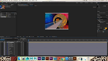
I opened my photoshop file into After Effect. I merged the layers by pressing command+shift+C. I added the first text, wrote it and then added other texts. When I added all the texts I moved on animating them.
The main form of animation that I will make is more like moving, rotating and change of the size.
To animate the first text "Discover the Undiscovered" decided to use rotation. The text was divided on two bits-'Discover the' and 'Undiscovered'. The first text I decided will rotate from up to down and the second from down to up.

I watch a short tutorial on how to move the anchor point.
The image below shows how the poster looks with the text. The 'Undiscovered' bit was in black however later I changed it to bright orange so it won't blend with the background. The "Natural History Museum" bit, I decided, to fill in the same colour.


I wanted to add something that we learned from the workshops we received, so I decided add light. the first few times I tried to create light it did not appear as I have forgotten to turn the layers into 3D, so I turned them into 3D. Firstly I wanted to make the poster black at the beginning and then the poster gets brighter and brighter, however after some thinking I decided to put the light at end, making it darker and darker until the screen goes completely black.
29th Nov 2018
These, I believe to be the the last steps of my practical side of the project. Today I added the missing bids of the final poster, adjusted animation, and previewed the poster as a whole before being satisfied with it completely. there are still some aspects of the poster, that I may try and change at the last week before the deadline of this project, however since I have done the most important of the project (the things I planed to do), I think I would not be as worried as I was before finishing the poster.
As to adjusting the animation of the poster, I just shortened the period between the key frames if the texts as they were rotating very slow. Before that however, I had to changed the resolution from full to third as my poster was loading very slow and sometimes it was not loading at all, so I could not see how the animation looks.
When I was done with fixing the animation I started adding effects. As I said before I planed to add stars to the poster. To that I went to "Effects" on the top bar then click on "Simulations" and the on "CC Particle system II". The new effect layer is going to appear on the layer box and the effects will come on the left hand side.


To get the final effects of the stars I played around with the effects however at the end I kind of started getting somewhere. I kept the birth size and the death size of the particles in quite similar size. I also changed the particle type to 'star'. I also increased the resistance a little, so they don't fly to far and too fast. The rest of the settings I believe I left untouched.


04/12/18
The final effect I added today was light. I went to the later bow, right clicked then I went to 'new' and then 'light'. I set the type of the light on 'spotlight' and then left all other options as they were and clicked 'ok'. My plan was to make the poster to smoothly go darker until it gets completely dark at the end. To do that I increased the radius of the spotlight so it goes outside the borders of the poster. That created a key frame. Then I moved the 'current time indicator' little further and reduced the radius of the light until the entire poster went black.
06/12/18
Today I rendered my After Effects file. To do that I had to go to Adobe Media Encoder as I could no do that on After effects because the new version does not support the H.264 format.
When the rendering was done I clicked to preview the video. When the video started I noticed all 3 texts were missing. So this meant that I was left with the stars only. The spotlight I added at the end of the video was also missing.
