Research
TFL (Transport For London) related Images


I like this poster because of its simplicity of shape and colour. It leaves a clear message.
Probably advertises the oyster card. It is easy to figure out what it represents.
These posters present features of the TFL or more specifically the London Underground.

This image shows the different lines that go into the London Underground. The fact that all the lines are in different colours makes it easier to find the one you are searching for on the, complicated, London Underground Map.


This one has the logo of the TFL but different colour and text. " UNDERGROUND" written with capital letters and solid font suggest the importance of the word, which is intended to attract attention.

Design Circle

I think that the design circle will be very useful while evaluating my project as a general and checking for missing bits.
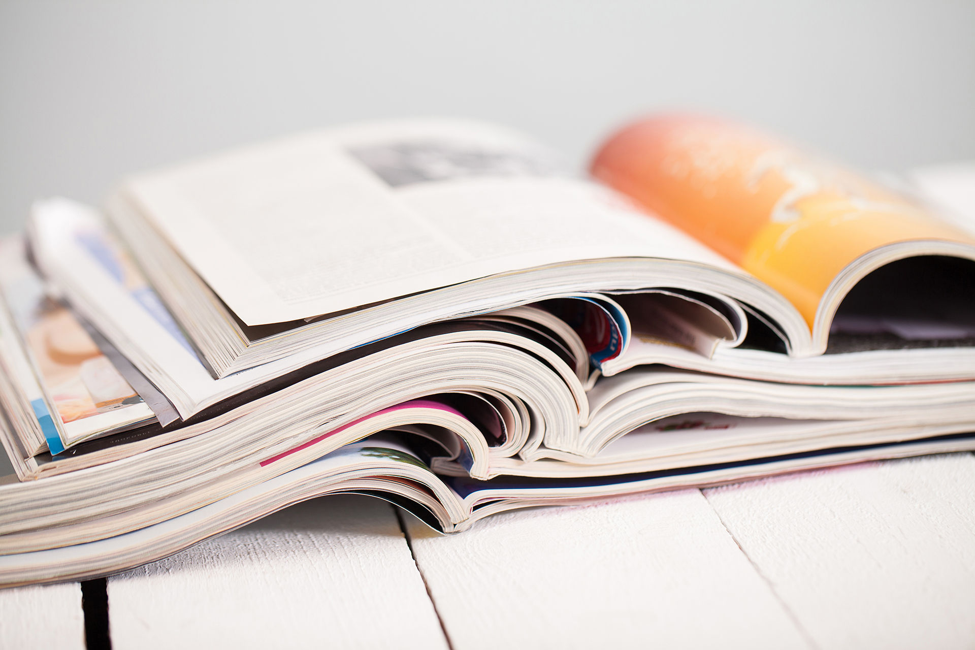
Research Methodology

Primary Research Vs Secondary Research
Primary Research involves Data that has been gathered for the first time or in other words first hand experience. It may include taking your own photos of your experience, for example if you go somewhere on a holiday or taking surveys, questionaries, interviews to ask peoples opinions on a subject. On the other hand Secondary research involves using data that has already been previously collected using primary research method. Sources of secondary research may include Encyclopaedias, Journal articles, Scientific research or basically any type of data that has been collected by others.

Primary Research
Pros
-
Could be more reliable
-
Quality over quantity
-
More of an experience
Cons
-
Time consuming
-
Travel
-
Cost
Secondary Research
Pros
-
Quicker
-
Cheaper
-
Wider range of surveys
-
Has a different insight
Cons
-
Proof-reading is less reliable
-
Less of an experience
Iconic London Buildings


The Gherkin took very little time to make since I only used the shapes sphere and torus. the main tools I used were the move tool and the enlargement tool.


To make a smaller and simplistic version of the National Gallery's entrance I used variety of shapes including cylinders for columns, rectangles for base and the overall shape, circle for the dome of the gallery. I used range of tools and techniques like move tool, scale tool, rotate tool, extrude and ect. This images show the final result of my work.
I choose to recreate the Gherkin and the National Gallery for this task. I like the style of the front of the National Gallery that is why I choose to make it.

Questionaries & Surveys
"Open Vs Closed Questions"

When taking surveys or questionaries people meet only meet two types of questions - open & closed. The two types are very different from each other and are used for different purposes. As its name suggests, open questions are those that can have variety of answers and explore people's emotions and interpretations - there are no wrong answers there, but it takes long time for the data to be collected. On the other hand closed questions only allow one answer in search of facts to be confirmed, in other words the answers are already given, the questioned just have to pick the one that they believe is the right one. In contrast to open questions, closed questions are less time consuming, but they do not explore range different of different views and perspectives.
Examples of Open & Closed questions
Open Questions:
-
what is your favorite destination in London?
-
why do you like London?
-
where do you plan to go this weekend?
-
what is the best experience you had while visiting London ?
Closed Questions
-
do you live in London?
-
are you born in London or the surroundings?
-
do you work in London?
-
have you ever been to the Natural History Museum in London?
-
do you like the London Underground
-
do you pay attentions on the TFL posters?
Trip To London (task 3)

These are photos from when me and my class went to a trip to London South Bank. When I took them i was aiming to get as much as possible ideas on what to do for the poster. I was in search for font ideas and what attraction or land mark to advertise in my poster.
Most objects I saw resembled letters. They inspired some ideas for creative fonts.
Most photos I took show the North Bank landscape, because I took them from the South Bank. Some of the buildings on both South and North banks are iconic and quite well know not only in the UK, but around the world.

"burning" b

This creative bench is shaped as a circle but from some angles it looks like an "O".

This image hides many letters in it including
M, S and W.

The fire on the photo looks a lot like a capital "b".
Walking cycles

There are two main positions-the contact and the passing.
However to make to animation smooth and more realistic two more positions need to be added-the low and high. The low position is called low as the body of the character actually lowers under the line that the contact and the passing positions create with their heads.
The high positions called so as the head of the character in the high position is above the line created by the contact and the passing positions.

Technical Research
Today ( 06/11/2018) I had some time researching on how to draw lava/magma on photoshop and similar softwares. I watched from 4-5 different tutorials and each helped a little on different aspects.
Some tutorials included stone shaping and shading and some advises on what background to work on. Some where about what brushes to use.
The first tutorial I watched was quite helpful at giving me an idea on how lava drawing skills can be used when they are mastered. At the end of the video the final result looked amazing.
Yet I found this tutorial not to be very beneficial for me at this moment, as right now, like a person a bit new to digital drawing, I believe I need more basic and foundational skills to learn.


The second tutorial was concentrated more on the use of colour. I had a go and tried to make my own version but this was not quite the type of lava I needed for my poster.


This image shows a sketch of a vulcano and planed to use the learned techniques. But then I decided to watch another tutorial that is more relevant to my poster.
Here I mainly used darker and brighter shades of grey to sketch the overall form and the direction of the flow.

The following images show how I used the last research to make my own version. To make it I only took so surface information and then try and experiment with different brushes and settings.
As a background I used the advised warm grey. Then I used brighter colour for contour. When I was done with that I started filling the stones with black.
When I was done with the stones I coloured the background in dark red.


The last tutorial I watched was the most useful of all the tutorials I watched as it was what I needed for my poster. I needed magma underneath stones or plates so it should look like thick fluid.
The tutorial showed that I had to put a darker background and then work with lighter colour and a soft round brush. As I used a graphics tabled I could control the opacity of the colour very easily. As was building up layers of colour I was slowly putting more pressure so the colour was getting birther.


This is how the research effected my project. On my opinion this change is positive for my poster, as it adds bright, and attractive colours to the poster.


Concept art
(space fantasy)
How the poster is going to look in general was inspired by the amazing concept arts of fantastic cities in the middle of the space. What I tried to recreate in my own poster was to bring a building or construction that belongs to the Earth, in the middle of the cosmos. The reason for that is I think it looks intriguing, interesting and somehow futuristic. I tried to pick the colour palette from the images below for the background.
I think this image research was quite useful for my project as it makes it appeal more to the younger as well as the older because of the range of bright colours and interesting concept.

